Table of Contents
Worse Than 2008, More Like 1929
As I said repeatedly over the past few weeks to clients: This market is worse than 2008. My Interview with ForexAnalytix and my client posts and videos past month have demonstrated that I see this crisis as unlike any others.
From March 13th client post:
- Sentiment: This is a human issue driving financial stress. 2008 was a financial issue that caused human stress. This one is way worse.
- Technical: The rate of change of selling is unprecedented. Market is down 28% in under 3 weeks, not 3 months.
- Fundamental: No one has a clue what is “Fair Value” for markets pricing in COVID-19 impact to company earnings, economic growth, government policy costs.
- Macro: Clear liquidity crisis that *could* lead to solvency crisis.
- Intermarket: This is not like the others.
Macro Matters: We are becoming much less global, against a CoronaVirus backdrop of demand destruction in a market structure of much more leverage than 2008 or 2000 with a worldwide shortage of US dollars. Biggest risk I see unaddressed in financial markets and not yet priced in – which can be worse than 2008 – would be Commercial AND Residential real estate markets pricing in calamity. Mortgage servicing is not only freezing amidst margin calls by banks, but mortgage rates are spiking despite Fed intervention. The combo? Worse than 2008 and potentially more like 1929 amidst a credit cycle downturn.
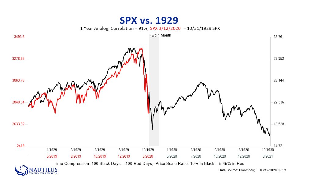
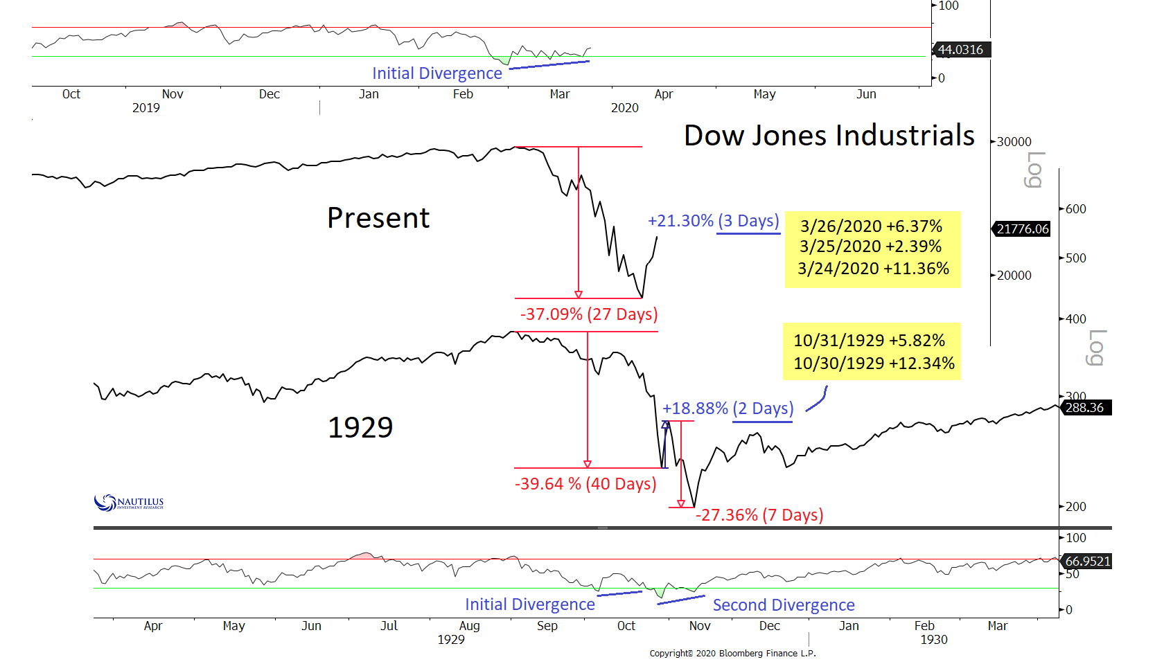
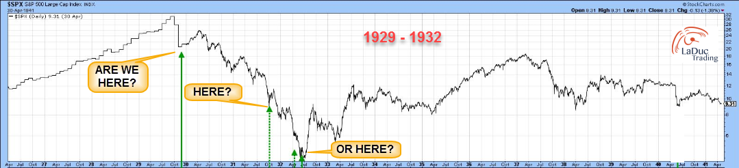
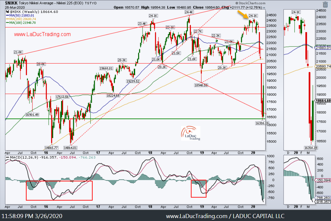
Since then, we fell! And to date, this fractal of 1929 still holds my interest over any others: 1987, 2000, 9/11/2001, 2008…
Kinda begs the question in my mind: Where are we?
I will have a better idea in the coming two months, but I think it will take a few months for markets to digest the volatility of the past month!
As I wrote for clients yesterday: What An Economic Reset Looks Like, Technically
Tactically, I have a very simple but powerful indicator that helped me spy and alert clients when to short (Feb 18) + when to cover (Mar20) from this recent market crash. I saw the rally too, but that was relatively easy compared to what’s next. Trading, moving forward, will be like Bull Riding: Violent and Dangerous. And here’s why: An Economic Reset awaits if thrown and you end up under the Bull.
Stock Bond Volatility Analysis Warned
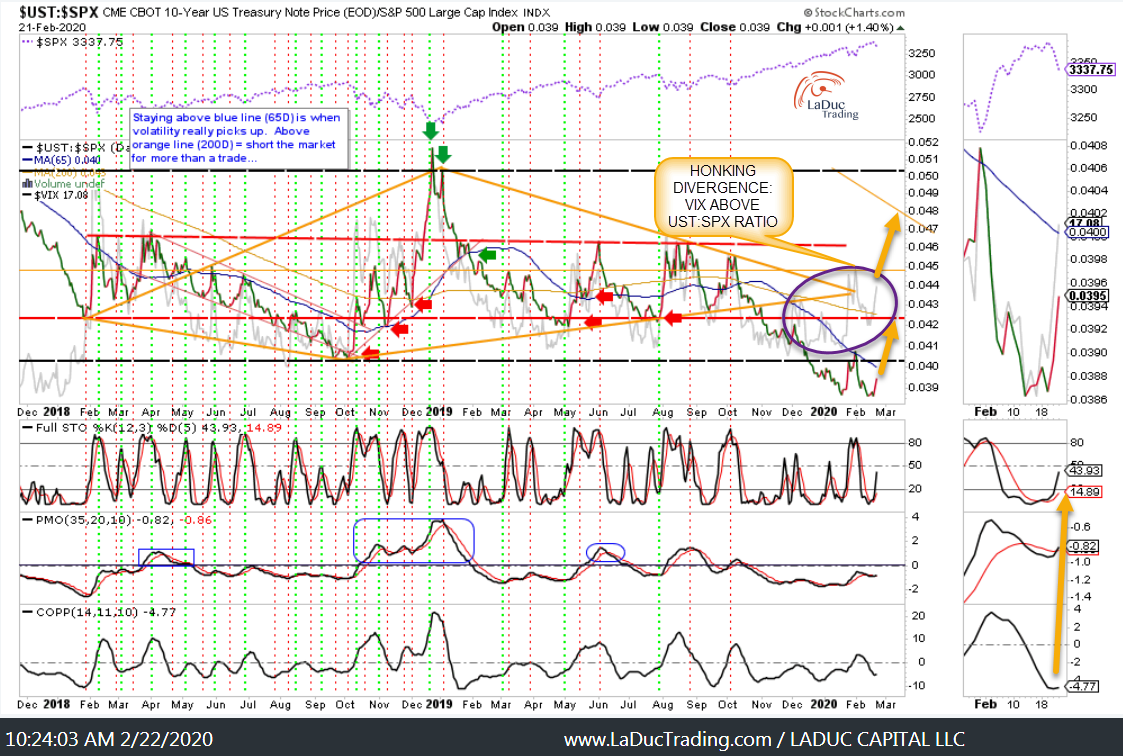
When I warned February 22nd:
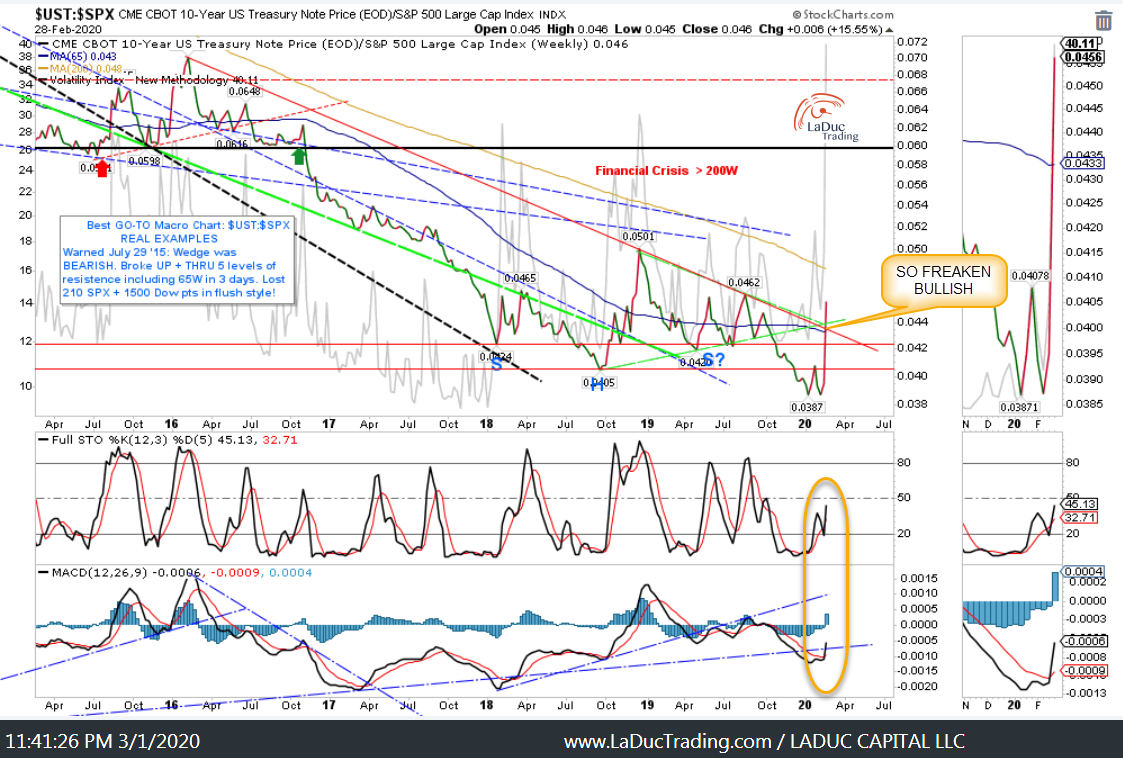
Again March 1st:
And again March 12th: (not done)
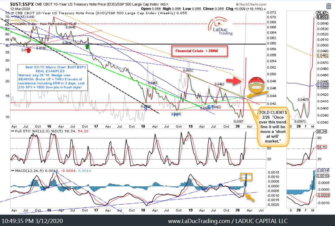
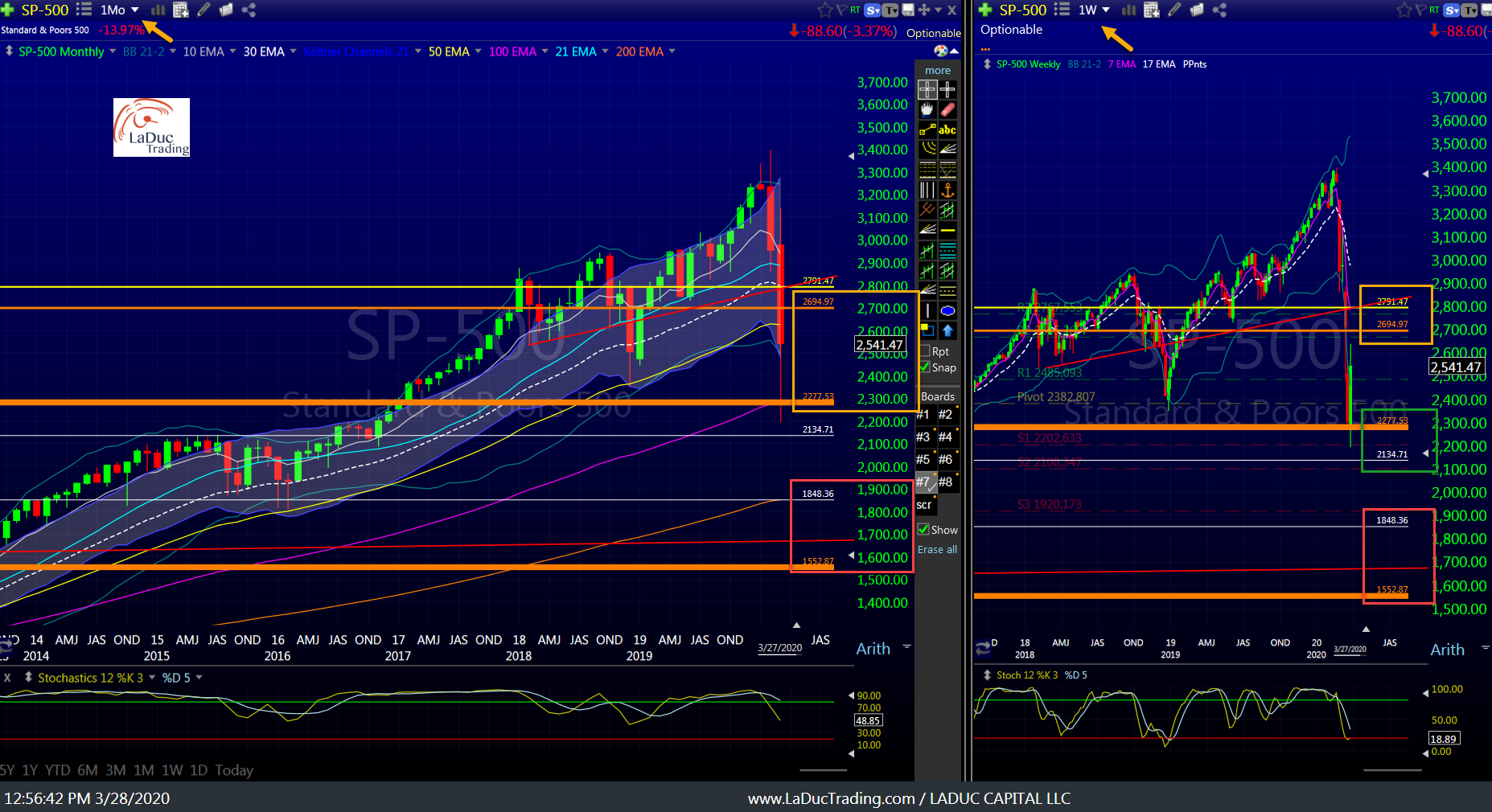
Fast forward to the present and ironically, the recent rally the past week occurred precisely at this line of resistance on my Stock-Bond-Volatility ratio 
And just to catch you up, this Stock-Bond-Volatility analysis I have provided CLIENTS was worth 10,000 Dow Points!!
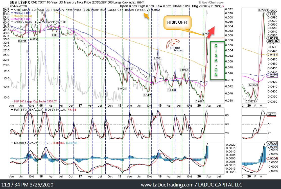
Pace yourself: it could be a few months before we get above the 65M.
And when/if we do, it would clearly represent a cascade lower – potentially like the six months from Oct – Mar 2008!
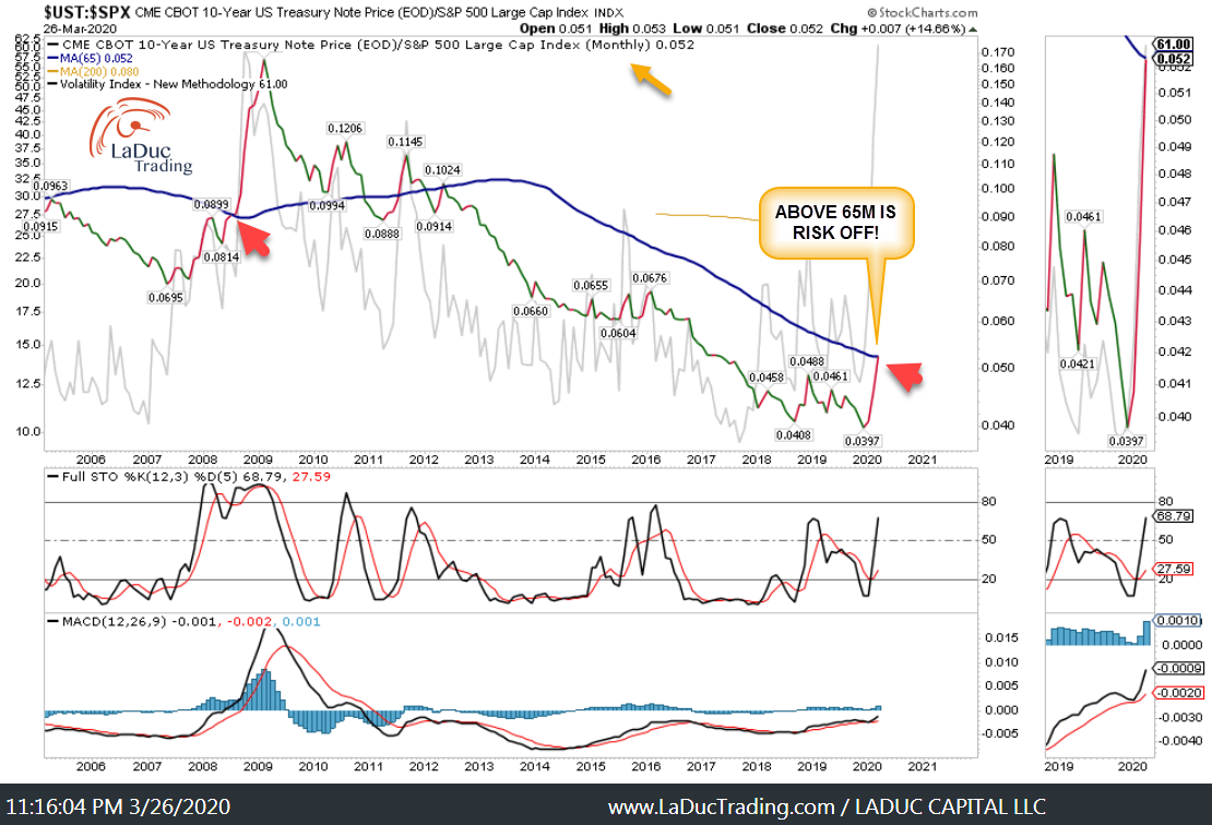
As much as it *feels* like a market that could roll lower like 2008, currently, I contend this market is much more like 1929 with a 2008 kicker!
“If the market doesn’t shake you out, it will wear you out.” With that, it could be *awhile* before we head substantially lower.
Review of Macro Trades
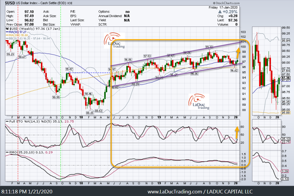
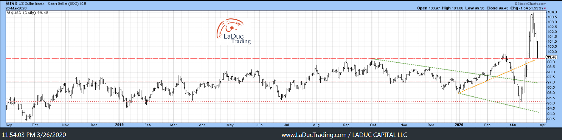
Jan 21 Client Post: Gone Fishing Newsletter: US Dollar Edition
My Bet: US Dollar heads higher and here are some general Macro reasons why to support my chart read:
- Whether as risk off trade or bet on best global market (dubbed the “Smile Trade”), the USD typically outperforms.
- USDCNH reversal (as discussed in trading room past week and here, USDCNH should continue higher and with it continue to put a bid in DXY).
- As Europe and Japan engage in more monetary/fiscal stimulus, their local currency devalues and keeps a bid in the DXY.
- While other countries engage in QE and rate cuts, it makes the US look like we’re running a tighter monetary policy in comparison.
- And let’s not forget, funding markets around the world are still very short of US dollars.
Followed up March 7th saying USD would hold and move higher:
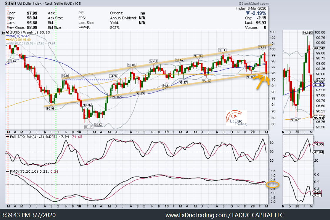
Last week: No less than 13 Fed stimulus programs and actions were created so far this month, including unlimited QE in government-backed debt at $125B per week, corporate bond buys, a TALF that includes credit card debt and a promise to create a ‘main street lending program’. The moves will ease funding stress, but by underwriting credit risk, the Fed also makes USD-assets more attractive, so I’m still bullish USD>
Let’s not forget: Global margin call reveals there is a $12 trillion short squeeze. And this is after a record move in the US dollar:
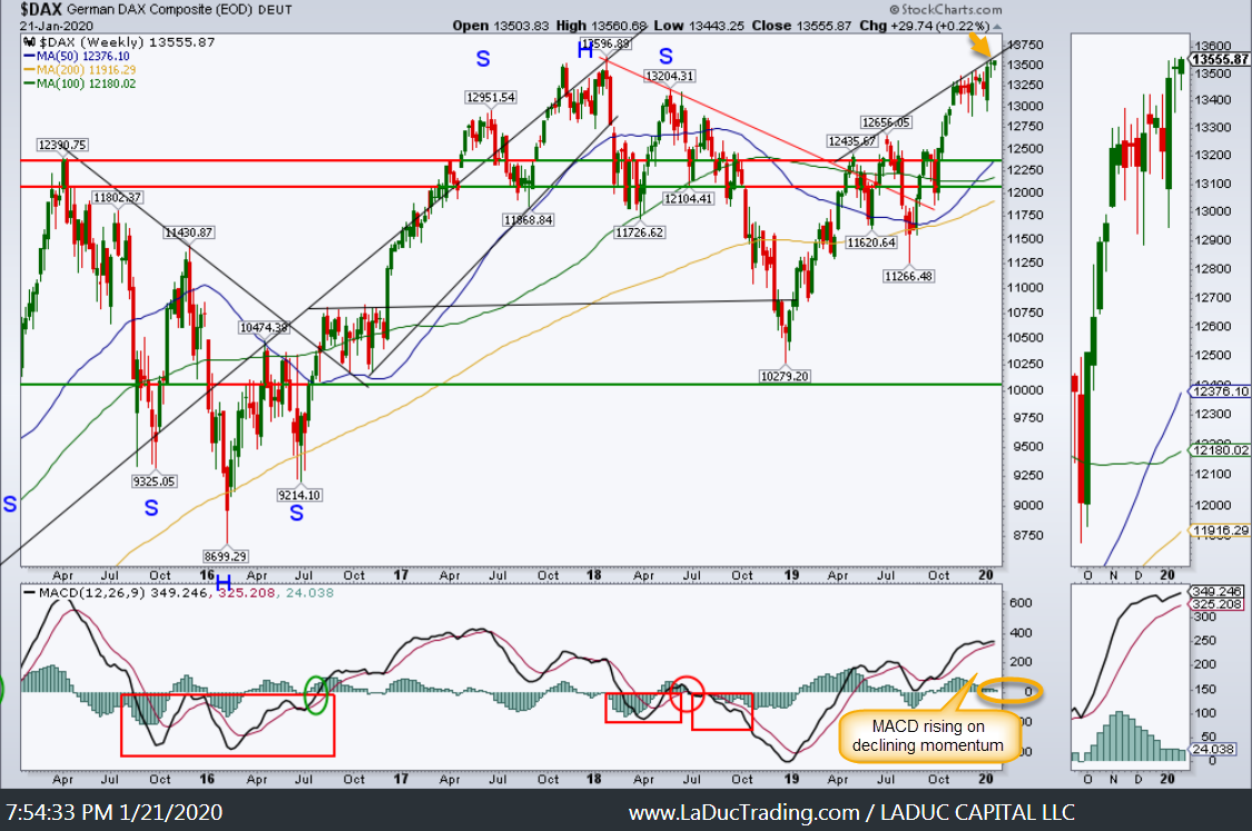
Jan 21 Client Post: Emerging markets will not like a higher USD. Just so happens Germany looks poised for a pullback with Japan.
Updated Short Recommendations with Price Targets:
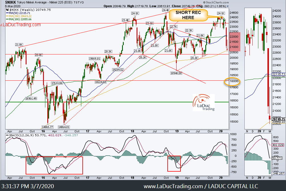
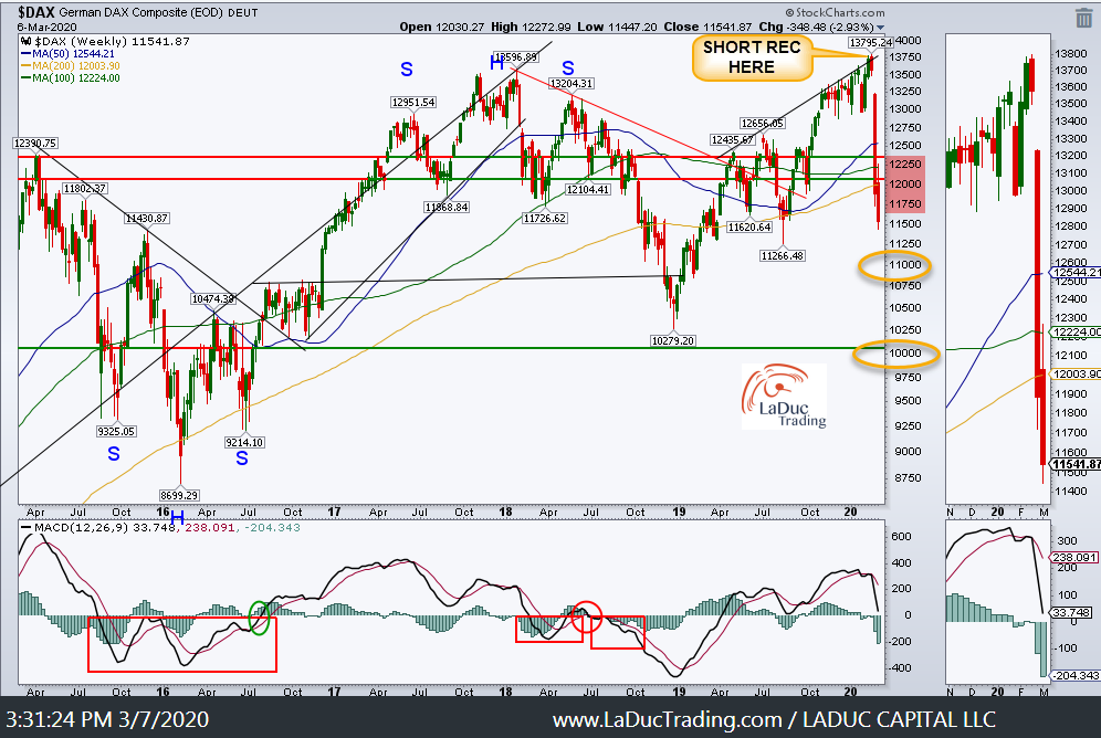
This week:

Jan 21 Client Post: Oil & Gas Plays short are working since Jan 7th as called out in my trading room. They should continue to be under pressure, with Crude Oil, as the US dollar rises.
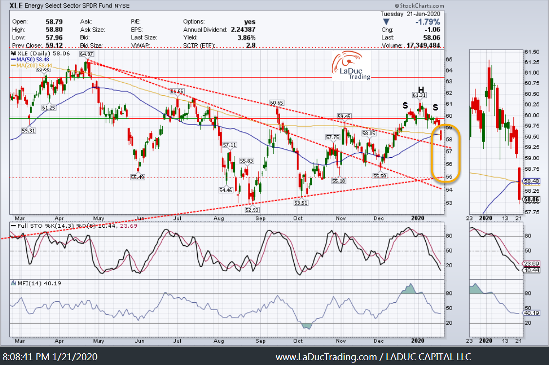
XLE tagged $23 from $58 and Crude had its biggest monthly loss ever of -60%.
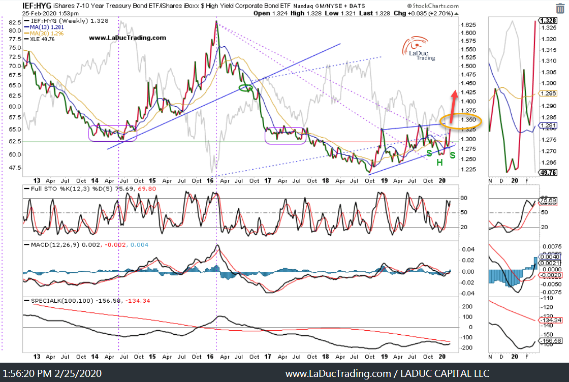
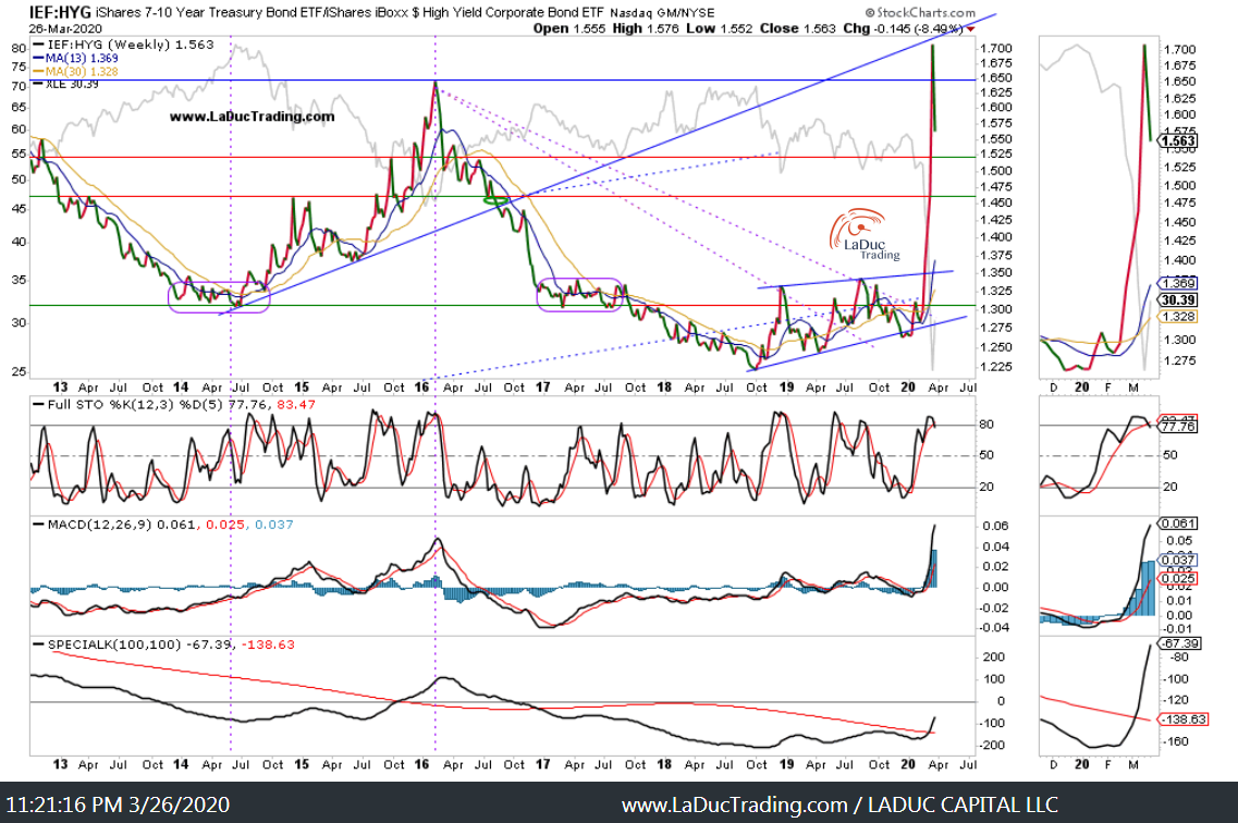
HYG fell from $87 to $67 as my ratio work suggested a big risk off move was coming!
We are here:
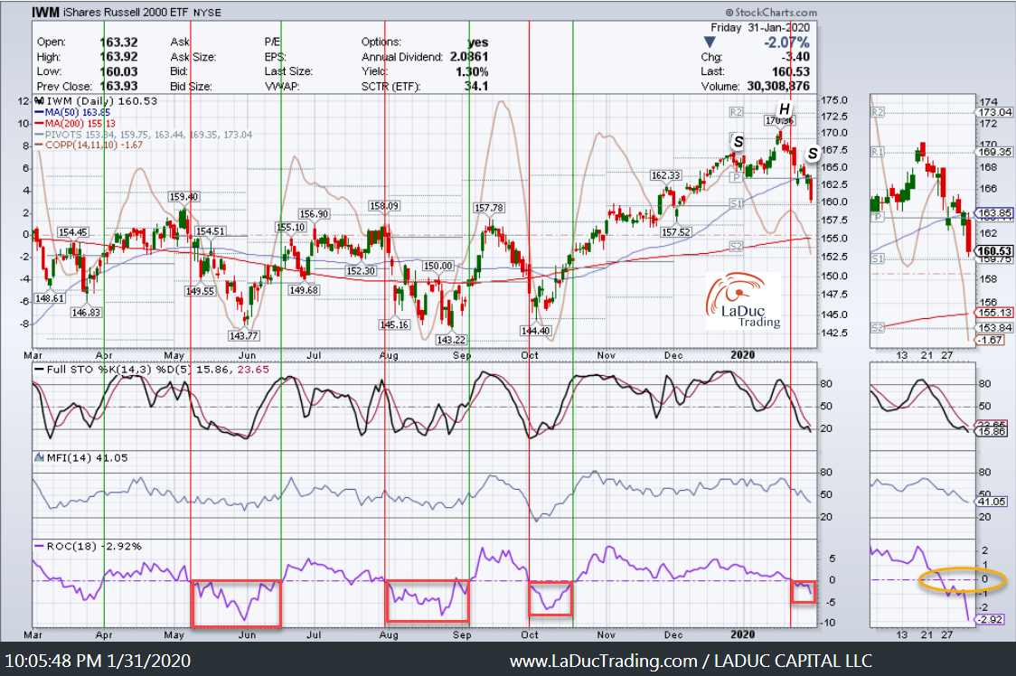
Wow: Small Caps fell from $160 to $95, which was much further than even I expected.
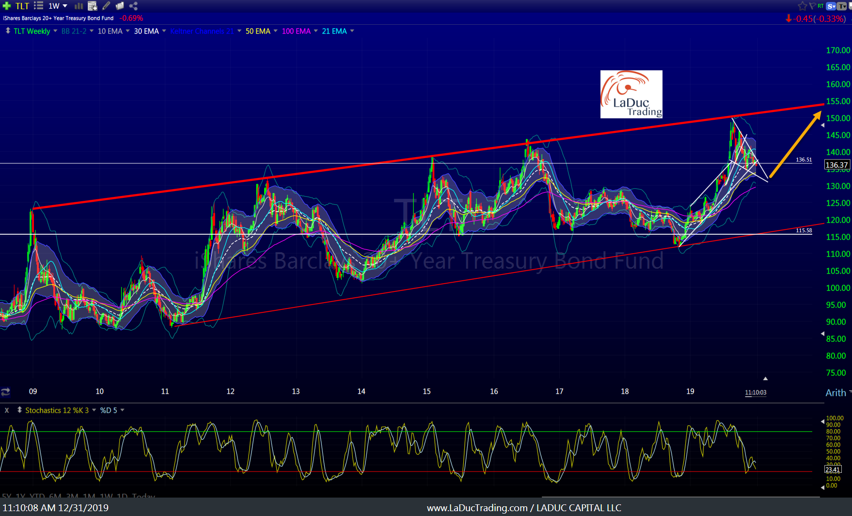
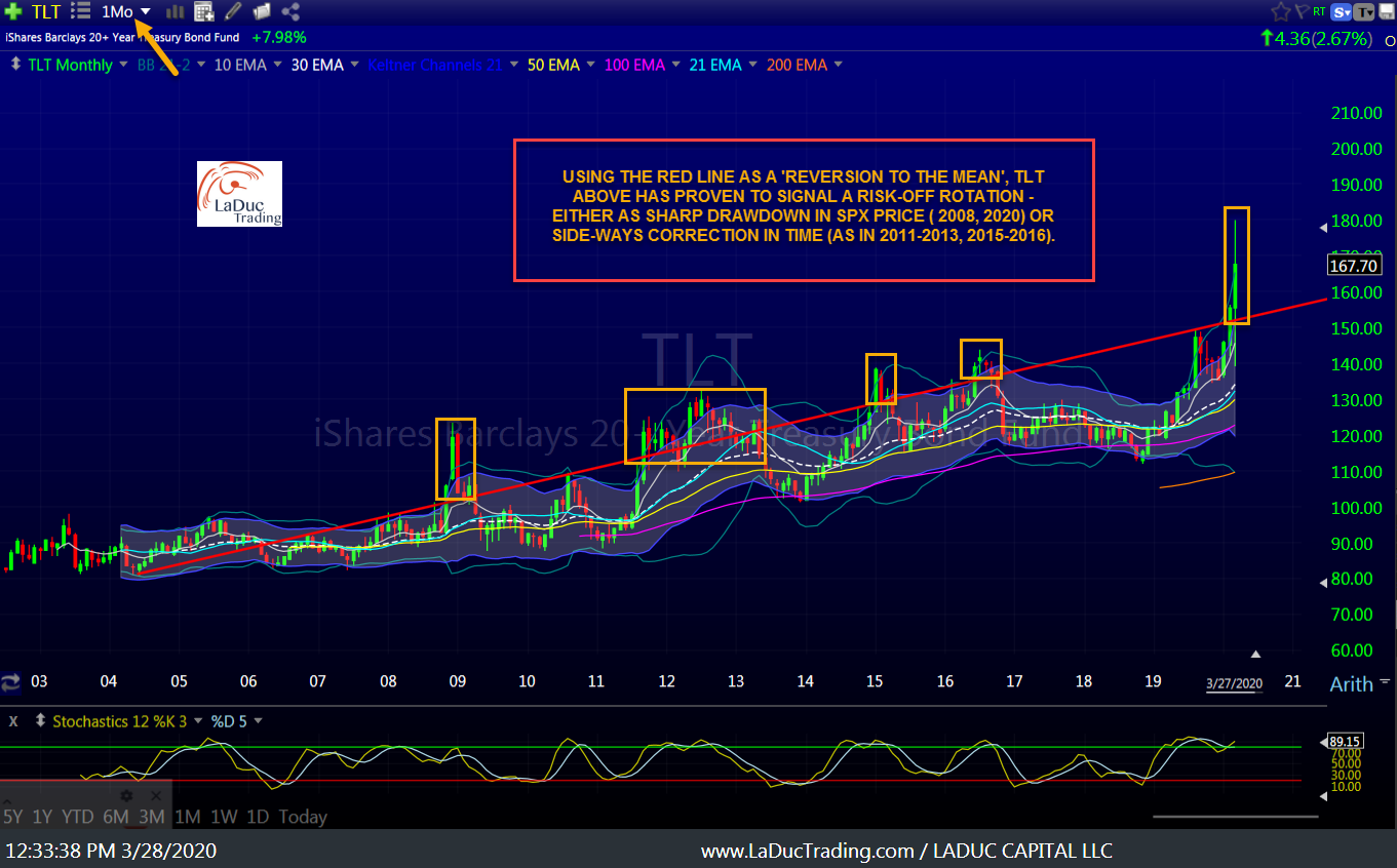
And let’s not forget bonds…wherein TLT ran from $136 to nearly $180 this month.
Now:
Breadth Divergence As A Tell
Here are some updates to breadth charts I posted. I think many have “bottomed” for now, but they need time to form a sustainable ‘bottom-fishing’ pattern.
Jan 21 Client Post: Breadth Divergence Worry: Despite QQQ trading at all-time-highs, NASDAQ summation index $NASI is approaching Sept lows!
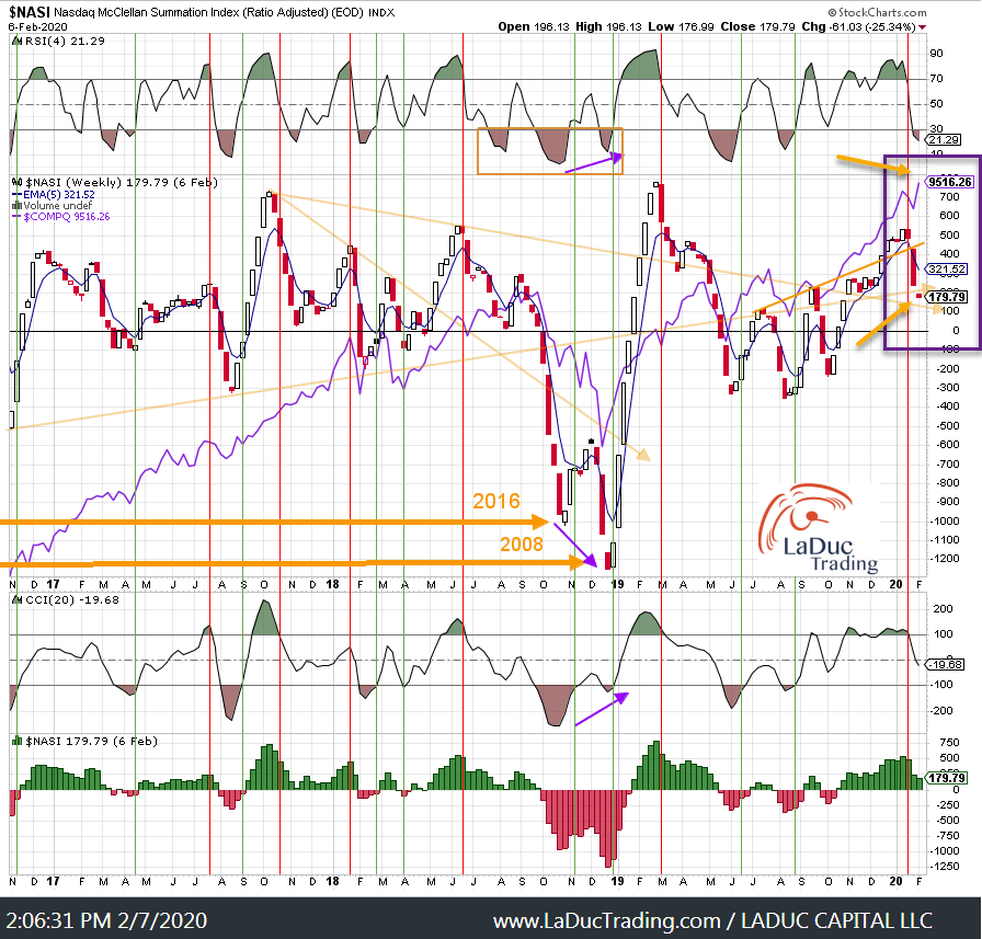
Yes, it’s worse than 2008:
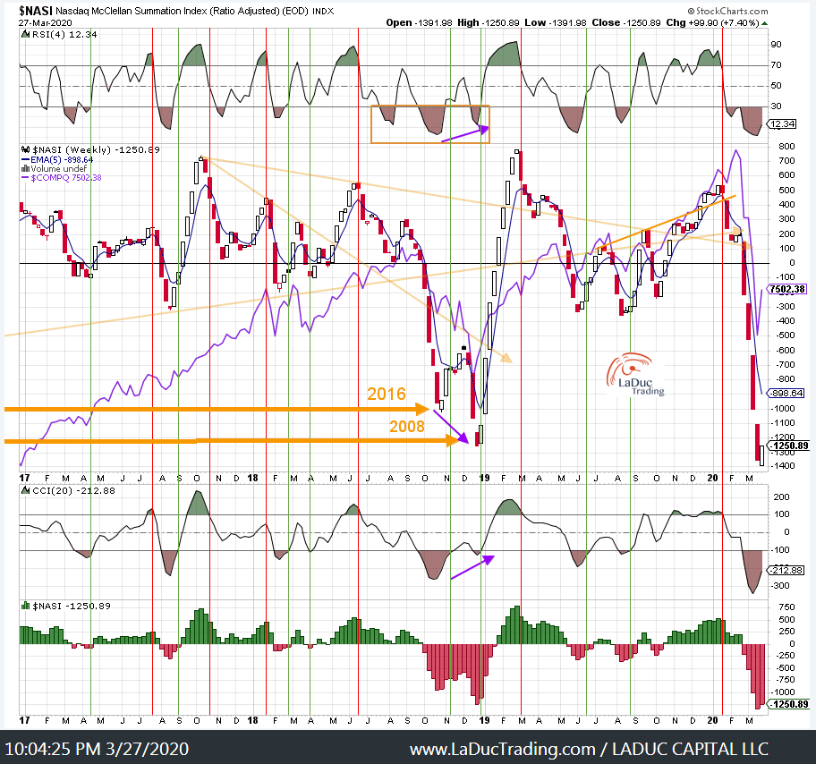
Warned we were nearing a pullback as divergences continued to pile up:
Now we are extremely oversold… but not yet safe.

Yes, we can bounce, but until breadth charts like this are ‘safe’ again – and I will let you know – assume that the market will swing violently in both directions!
Breadth is on the floor! And still needs to lie there awhile before I trust it to move higher for more than a trade – just like it did in 2009 with the double bottom before a ‘generational’ low. That bottoming 2008-2009 digestion period took a few months at which time market participants and hedge funds needed to learn to trust the Fed and Congress again. And that may be a long while…!!
Still Not Safe
Despite very likely bounces for the next few months, just keep in mind big picture:
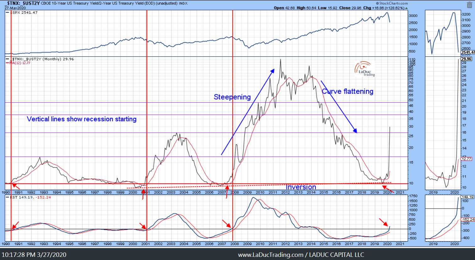
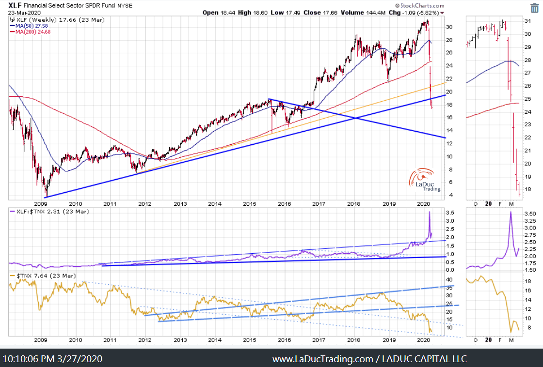
There is nothing safe about this market as evidenced from one of my top Recession Indicators, one of my top Breadth reads and a very obvious technical look at Financials still in risk-off mode.
Yields Call B.S. – and Fed will soon have no ammo for it’s gun. They will have to move to asset purchases, QE and related Monetary with Fiscal emergency action to stem the fear which is now being priced into markets for economic recession. Intermarket Chart Attack: Recession Watch Time

Lots of Trading Opportunities, But Investors May Want to Tread Lightly
EITHER WAY: JOIN ME IN MY LIVE TRADING ROOM!